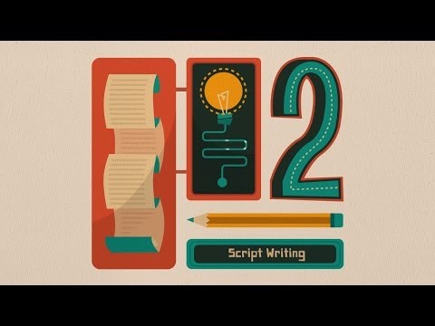
You might be wondering what are the steps involved in creating an animated explainer video? We’ve laid out the process in a simple infographic piece to answer that.
This animated infographic is produced based on it’s static version here :
http://visual.ly/what-it-takes-build-animated-explainer-video
What is an Infographic :
A lot of phrases get thrown around in the world of information graphics. “Infographics.” “Data visualization.” “Information design.” While the more pedantic out there might argue about exactly what kind of information belongs in each category, we prefer to acknowledge the fact that most of these things
overlap. So let’s step back and, instead of strictly defining terms, take a look at the overall category.
We use the term “data visualization” as the overarching word for all this stuff. What “stuff” are we talking about? We’re talking about any graphic that displays and explains information, whether that be data or words. When we use the term “data visualization,” we’re using it as a general term used to
describe data presented in a visual way.
To us, infographics are different because information graphics have a flow to them. They’re data visualizations that present complex information quickly and clearly. Think of maps, signs, and charts used by statisticians or computer scientists: Wherever you have deep data presented in visual shorthand,
you’ve got an infographic.
Infographics are important because they change the way people find and experience stories — especially now, when more and more infographics are being used to augment editorial content on the web.
Infographics create a new way of seeing the world of data, and they help communicate complex ideas in a
clear and beautiful way. As the world gets more complex and more data emerges, information graphics are more useful than ever.
Data visualization often deals with an enormous amount of data, with the goal of discovering patterns.
Huge amounts of data are very difficult to sort through, but infographics make information presentable
and digestible to a general audience.
An easy-to-read illustration helps tell a story and makes data points easier to understand. And it doesn’t hurt when infographics are not only clear and straightforward but also beautiful and engaging. The aesthetic design draws the viewer in; the information helps the viewer analyze and understand the data being presented.